CONCENTRATION
CENTRAL
Artefact of the Product
REGULATION
↘ ~75%
customer acquisition through product
TODAY
10+
Events, Partners, Gloabl Brands on board
THE SHORT VERSION
GameRun had a report system, the output was PDF Files that resulted in only 25% customer acquisition, and a separate out of the app flow.
Users downloaded and shared the PDFs, and not the platform, the report was poorly designed and not properly accessible on phone.
I designed dynamic, responsive reports that work on web and phone, can be shared through app links and drive customer growth and partner event deals.
01 WHERE THIS STARTED
Two apps, one customer, and a banner pointing at the other one
RUPEEZY TRADE
A retail trader
Stocks and F&O. 97% of company revenue. Owned end to end.
RUPEEZY INVEST
An investor
Mutual funds. Smaller user base with separate catalog.
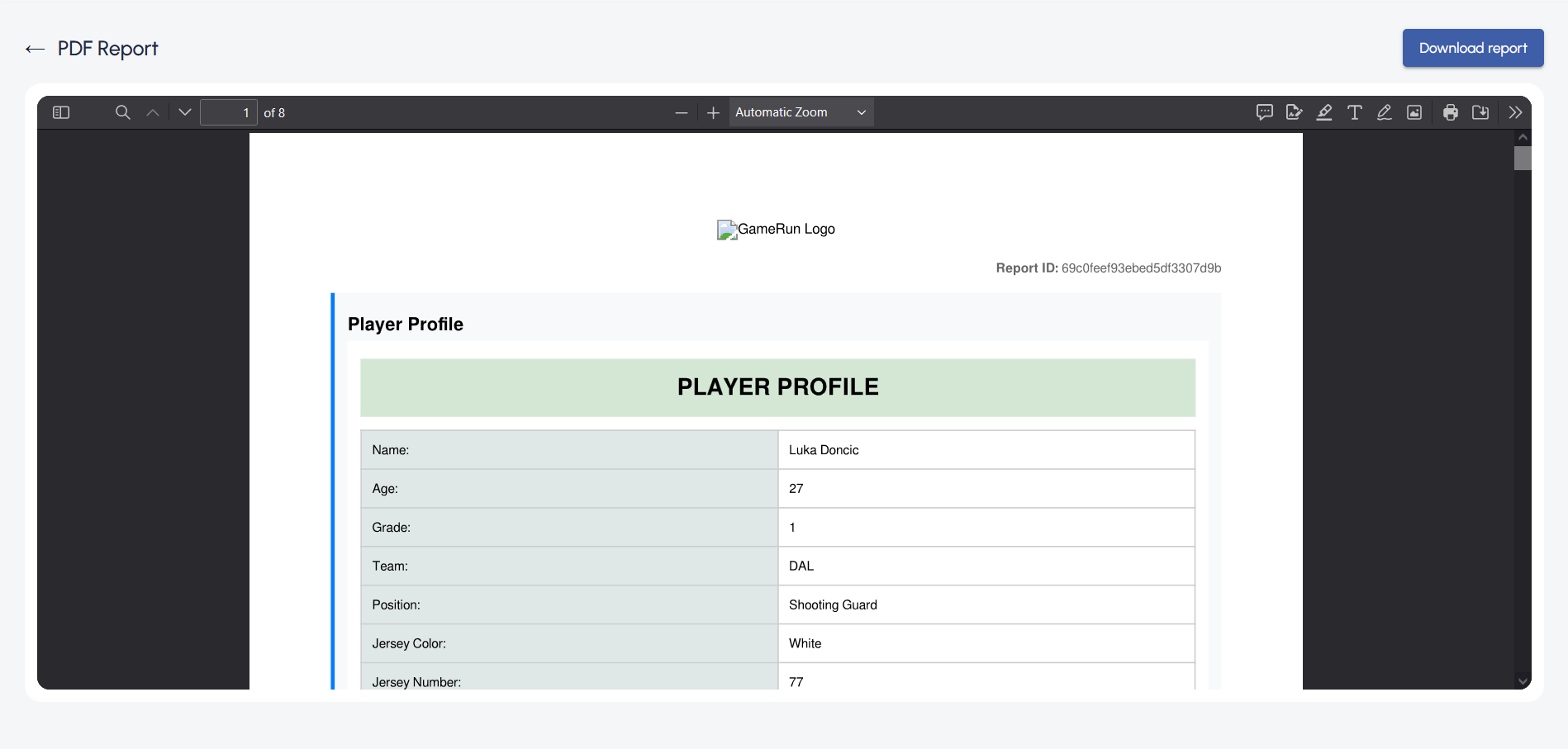
older versions looked bland and baseless
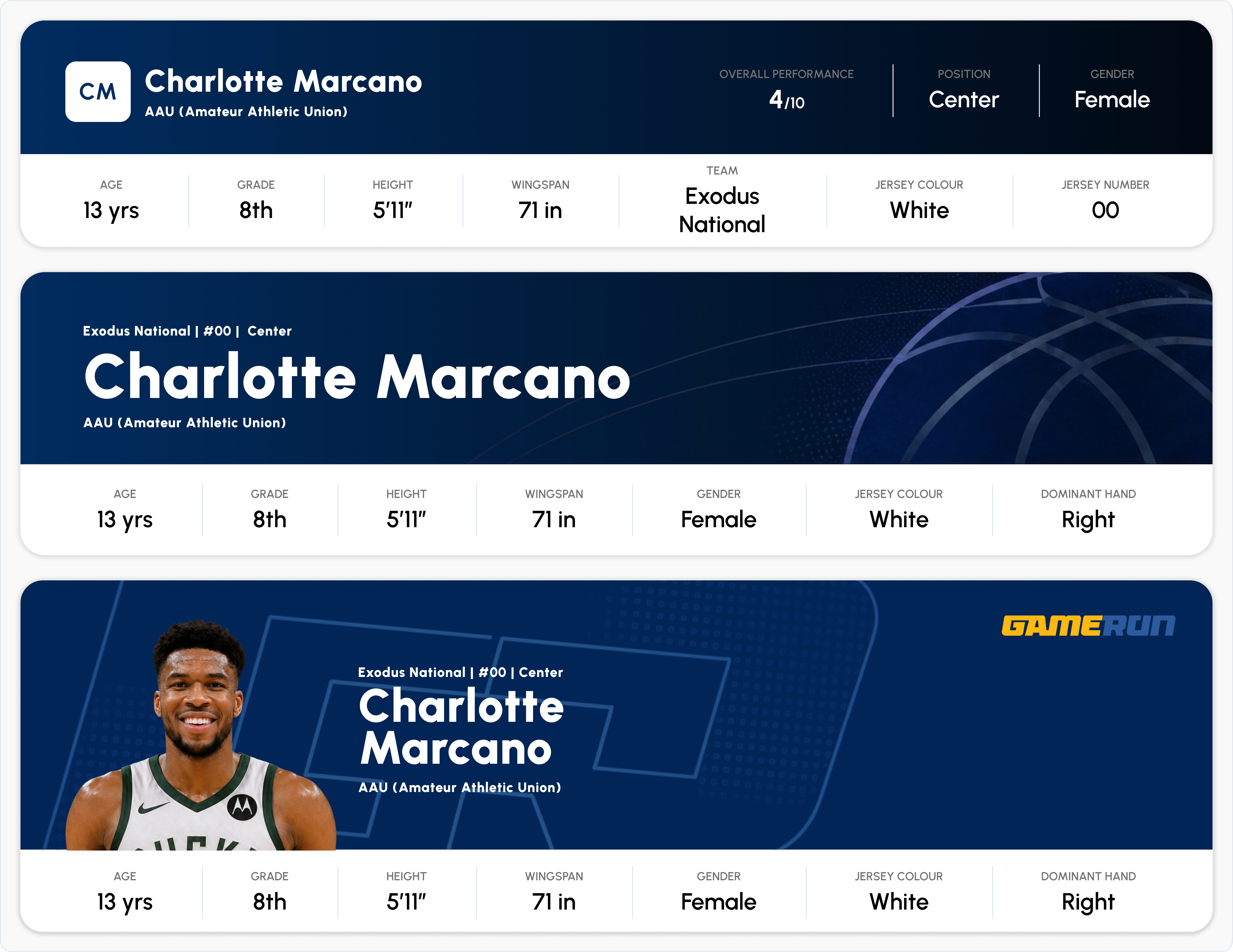
versions of new reports
“Every other broker has one app, so why do I need two?”
— Direct feedback from Google Play Store user reviews
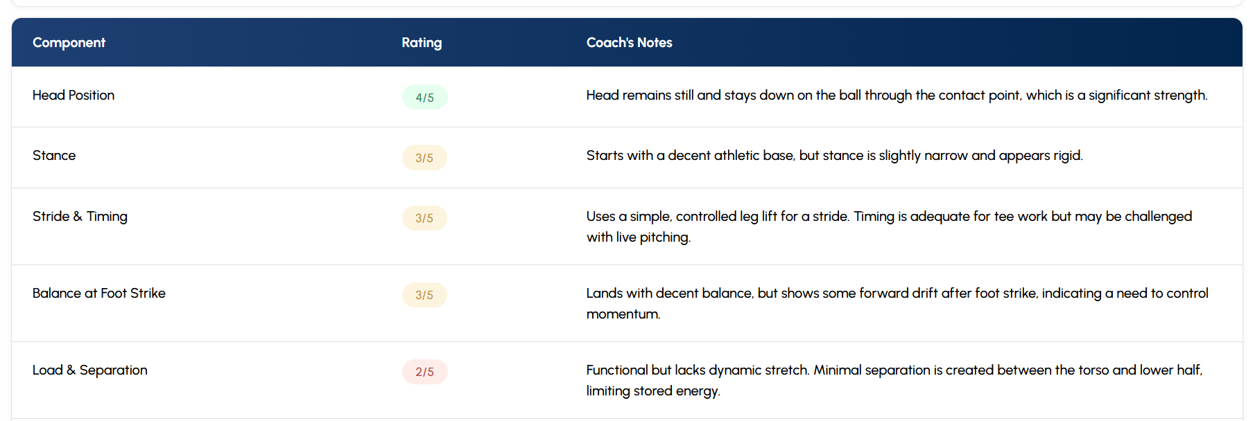
Metrics Versions through the history
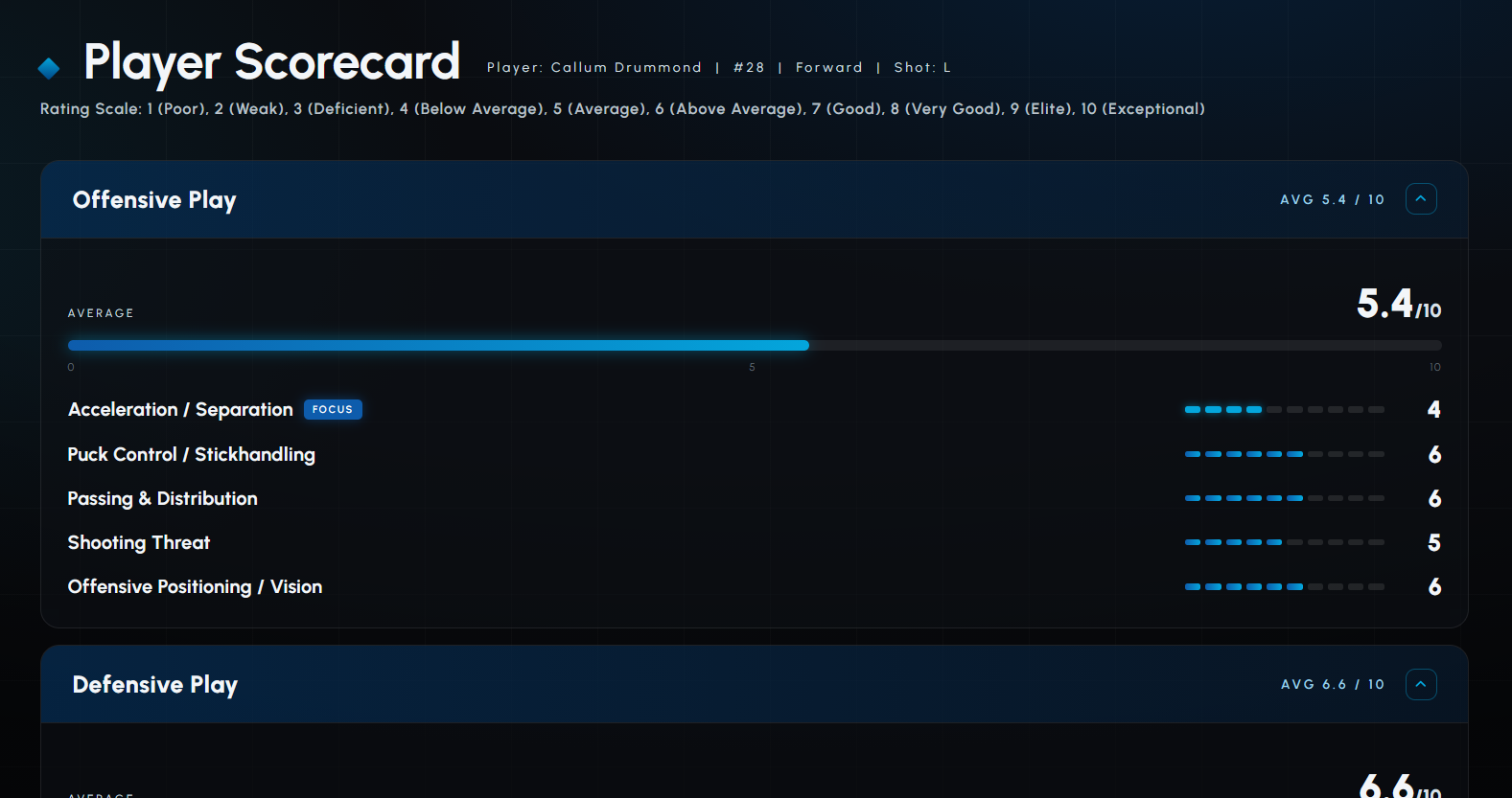
Moulded for partner reports sections
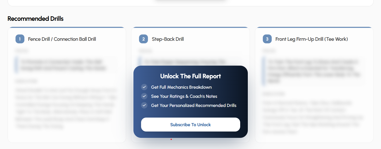
New pricinng meant new tiers, features and gating, i managed that as well
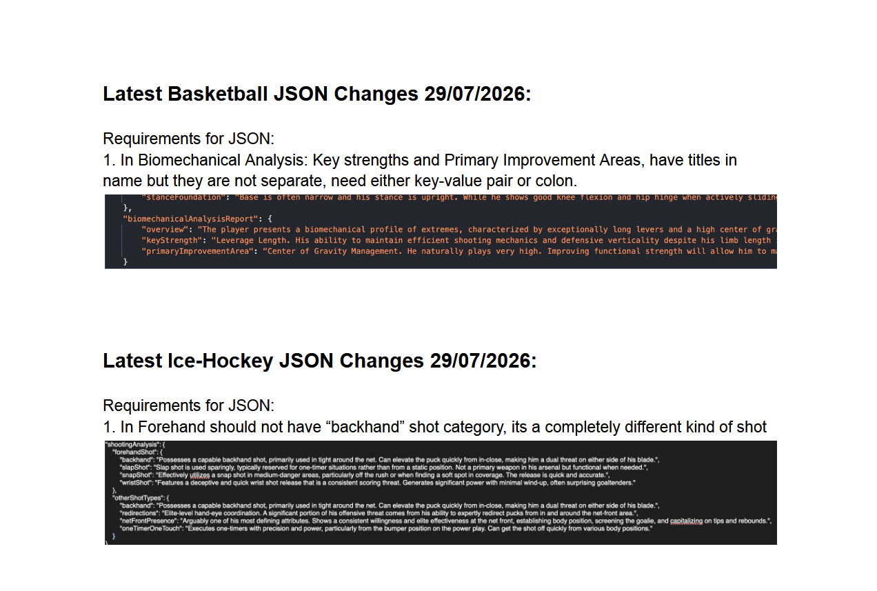
Wrote Requirements for AI Reponses with AI/ML Teams
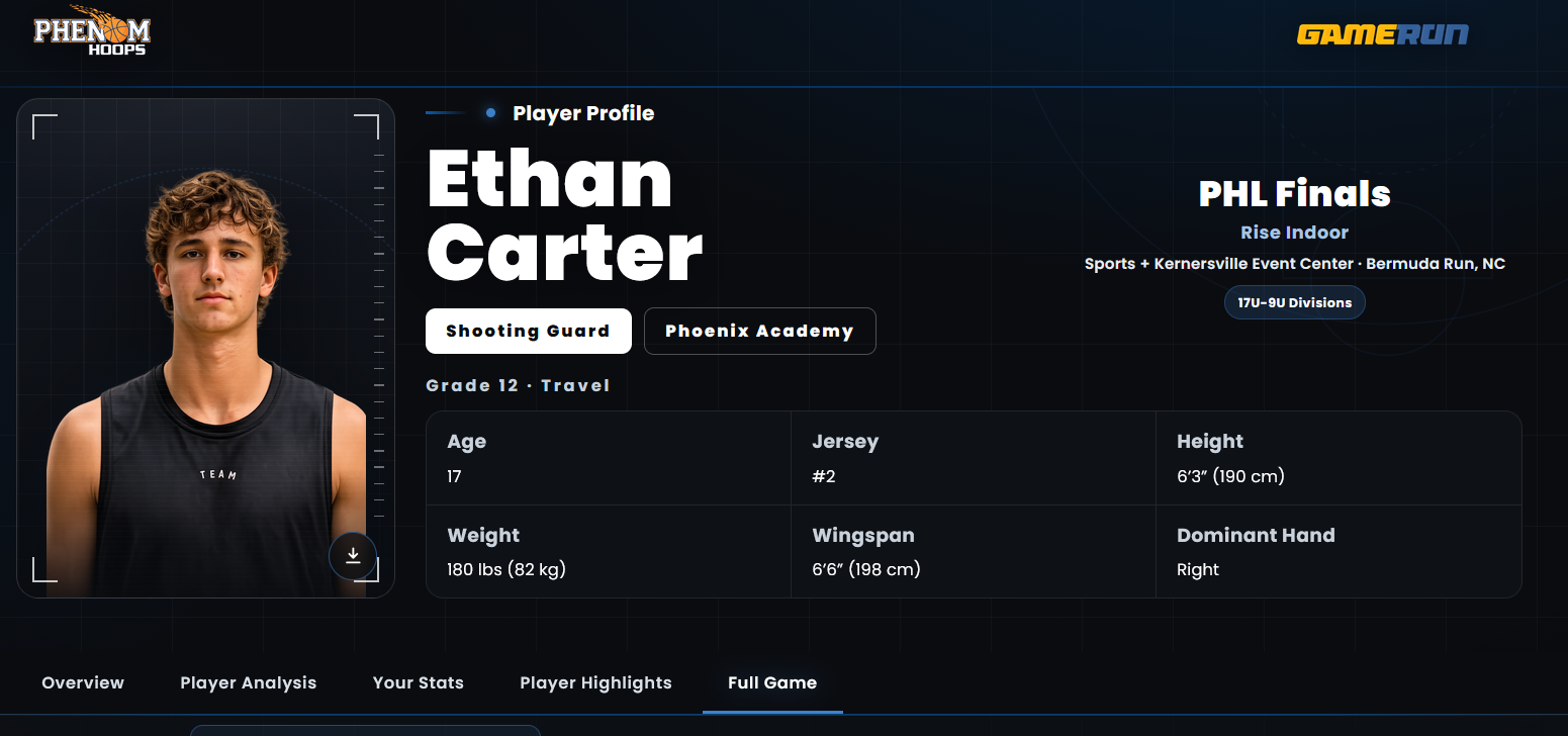
Outcome was great Reports
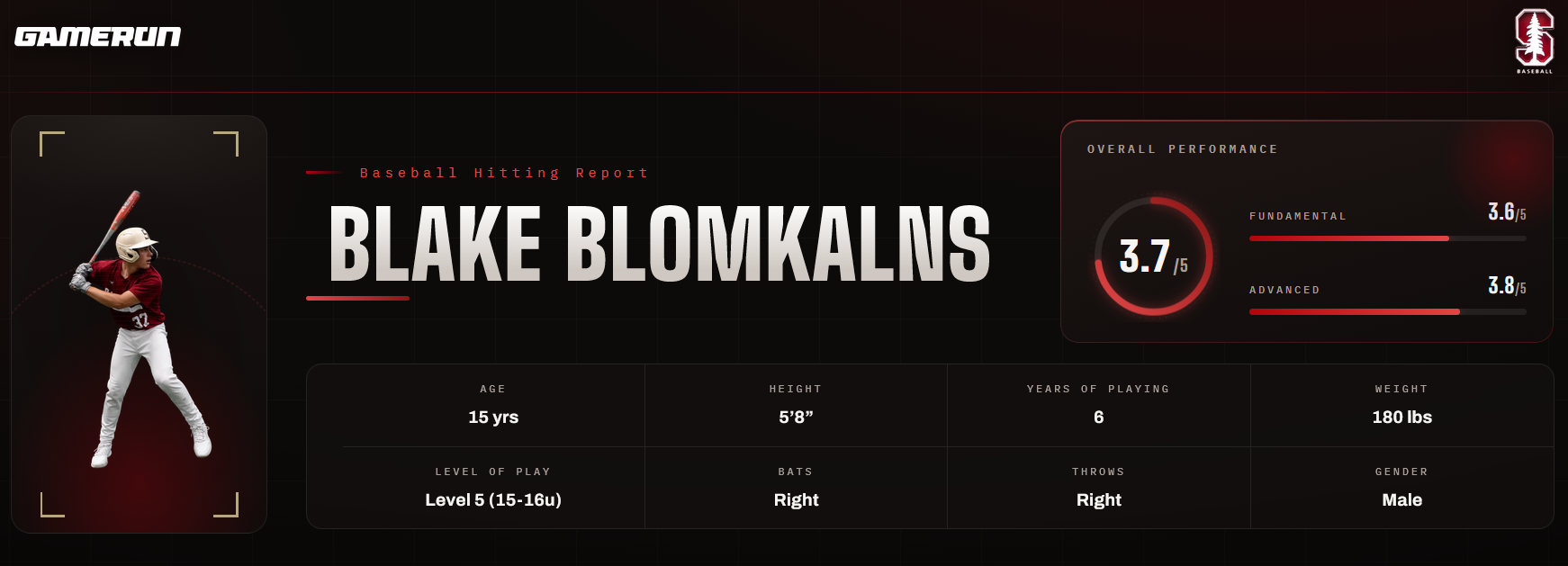
Multiple events and pages
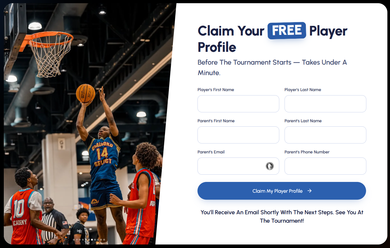
Marketing Pages
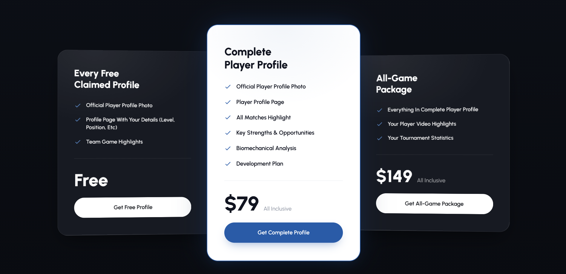
Marketing Pages
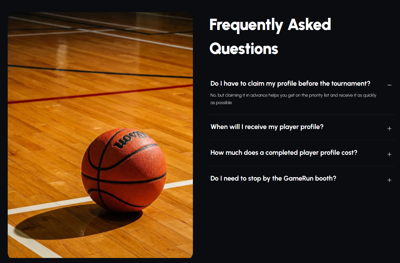
Marketing Pages
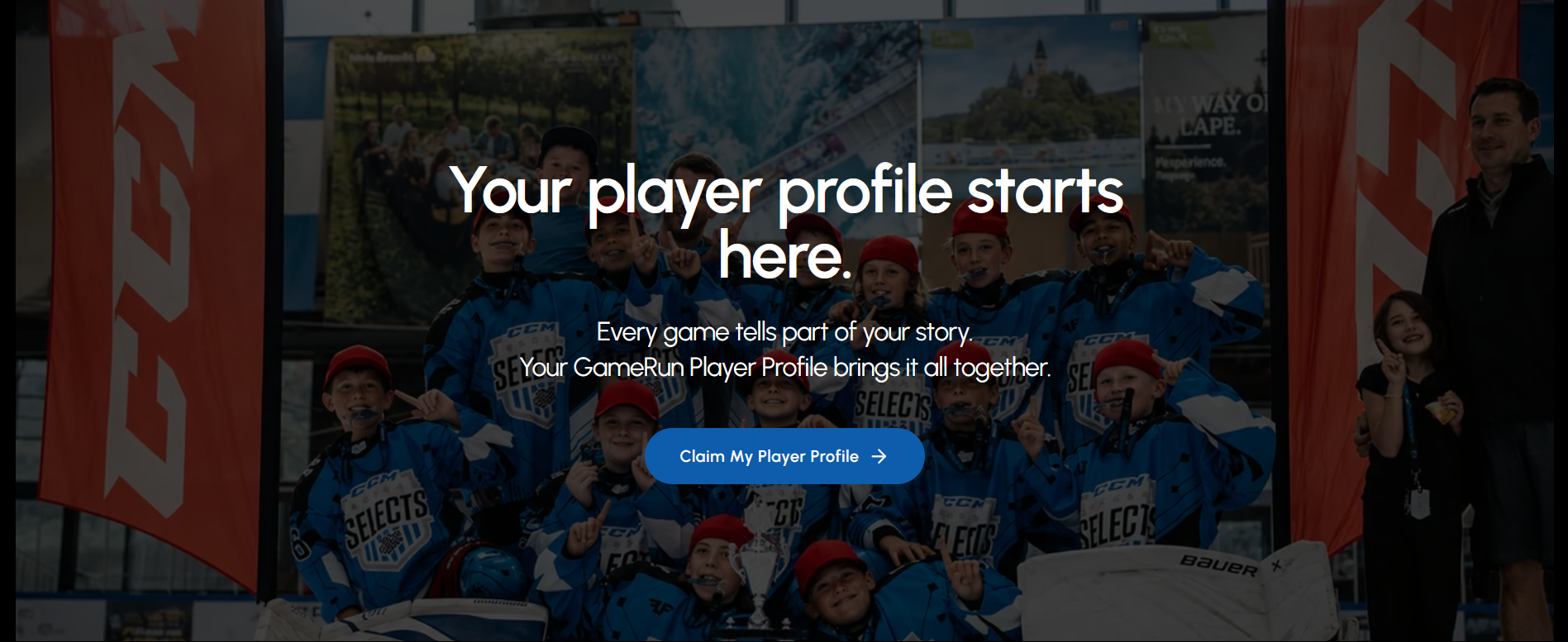
Marketing Pages
05 HOW I WENT AT IT
Architectural choices and trade-offs
REJECTED
Top navigation
Carried indices and alerts. Adding a switch required redesigning 8 screens.
REJECTED
Floating button
Only lived on Home screen. Users deep in stock pages were stranded.
CHOSEN
Bottom navigation
Present on every screen. Context switch is always one tap away.
VIDEO DEMO BLOCK
Fluid navigation in motion
Click to play prototype walkthrough
RUPEEZY_TWO_AXIS.MP4
00:45 · 60 FPS
INTERACTIVE PROTOTYPE SIMULATOR
Test the 2-Axis Switcher Directly
PROGRESSIVE ROLLOUT STEPS
Migrating users without shocking them
01
DISMISSIBLE
In-app banner in Rupeezy Invest announcing the unified merge.
02
MANDATORY
Full modal prompt. The only action left is launching the unified app.
03
SUNSET
Invest app leaves app stores completely. Zero account fragmentation.
WHAT I CAN CLAIM
Business and technical outcomes
NAVIGATION
3 products
Unified across stocks, F&O, and commodities.
MAINTENANCE
4 → 3
Two engineering squads merged into one squad.
COMPLIANCE
Once
Regulatory shifts implemented once on a unified repo.